Follow-up: Timetables for posting at stop poles (“Quick: When is the next bus scheduled to arrive?”)
Thanks to the readers and comment-makers, I received some enlightening feedback and new information after the post “Quick: When is the next bus scheduled to arrive?”
The best way of presenting information at stop poles probably depends on system features and also on customer expectations. In particular, at stops, or in systems where many routes share alignments, customers may want arrivals/departures ordered by time first as the primary variable. But where route alignments are divergent this is not useful. Customers would likely be better served with stop times separated out by route.
Jarret Walker (author of the excellent HumanTransit.org) kindly provided some photos of timetables posted at stops in Bern, Switzerland; Berlin, Germany; and Sydney, Australia. Below…
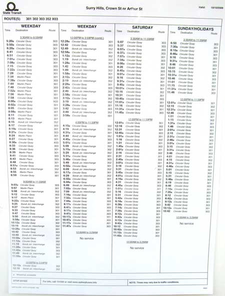
First, a timetable in Sydney, Australia that lists all stop times in order, with columns for destination and route.
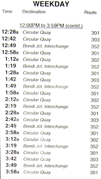
A more detailed view:
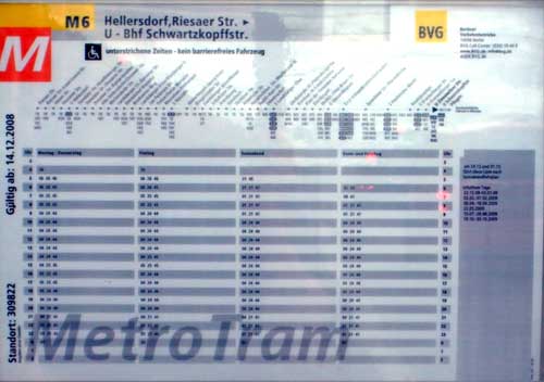
Next, some European examples. This timetable for Metro Tram in Berlin organizes stop times (expressed as minutes after the hour) into rows for each hour of the day. Note however, that the four columns with stop times show those times for the same line on different service days.
Next, here’s a similar arrangement as the Berlin example from Bern, Switzerland. The full ensemble of information includes a system map:
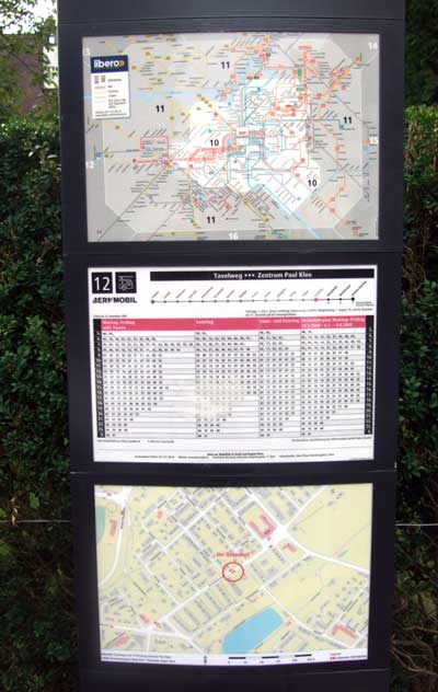
And, a detailed view of the Bern, Switzerland timetable:
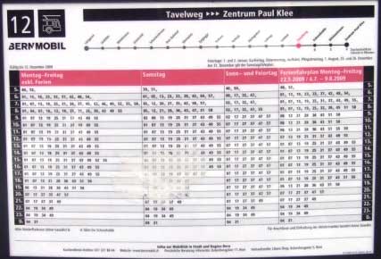
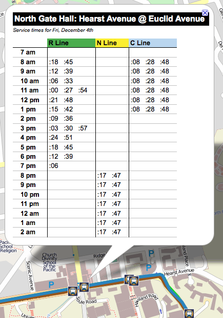
An adaptation borrowing on the Bern and Berlin approaches could be for each column to show stop times for a different line. This would make it easy to for customers to look up a time if they are only interested in a specific line, while also making it fairly easy to look up times for the next available service at a particular time. It would be necessary to have different grids for each service day. This would be an approach like what Trillium implemented for UC Berkeley Bear Transit (see image after).
Web-view of times for UC Berkeley Bear Transit: (this is still somewhat experimental/beta; for some stations with lots of service the timetable overwhelms the display space of the popup box):
Even after reading some of the articles recommended in comments on the last post, I’m not entirely sure which are the best approaches for presenting information at stops. Personally, I would probably prefer an adapted version of the Bern and Berlin examples as I proposed. The Sydney example is simple but provides less structure than the others, limiting its functionality. What do you think?
In conclusion to this discussion, one of the thoughts that arises for me is how necessary and useful it is to have good software to produce and maintain these stop-specific timetables and information. Otherwise, this is an extremely labor-intensive process. Aaron Priven, the designer of the AC Transit pole schedule I originally called out, described the system of Perl scripts and page-layout software that is used to produce the timetables in his comments on the blog. He says he may get around to open sourcing the Perl scripts AC Transit uses as part of the process to get data from the HASTUS scheduling system and into Adobe InDesign.
Also, TriMet has open sourced TimeTable Publisher, the software they developed and use in house to create all of their printed and online timetables. TimeTable Publisher is described further in this interview with TriMet’s Chief Technology Officer and IT Manager for GIS and Location-based Services. The software can import information from a variety of sources, including the Google Transit Feed Specification (GTFS), eXtensible Markup Language (XML) formats, or directly from a SQL database. Currently, the software does not include functions to create stop-specific timetables such as the ones described here. With an interested client, we could put some developers on it and then contribute back to the source code so that these sorts of stop-specific timetables would be easier and less expensive for other agencies to implement in the future. Is any agency out there interested?
Hi,
just wanted to throw my 2 cents worth into discussion here.
it’s and interesting article, that compares different approaches to display timetables in an user-friendly format.
imho, the berlin approach seems the most suitable one as it meets requirements of two groups of riders mentioned in article.
we have been developing webapps for passengers in poznan,poland and in the area, and used a similar approach.
with the only difference, that we list the next stops in an extra column (and not above the timetable).
we are actually thinking however to revert to this idea.
take a look here for an example:
http://www.ztm.poznan.pl/rozklad/#/showTimetable/2874/19/byLine
timetable is in similar format to the german one, allows you to see:
– all departure times for weekdays, saturdays and sundays,
– list of previous and next stops on this route (with time-to-next-stop information)
– info on other routes on that stop.
hope this could be useful in further exploration of the topic: “public transport information as friendly as possible”.
we also would be eager to find out if this approach could be further improved,
cheers,
Wojtek @ goEuropa
The best bus stop information I’ve seen was in the West Midlands, UK. For each route serving the stop, they provide (a) a route ‘line’ showing key detsinations downstream, and typical joruney times and (b) a list of all departure times. The latter is fairly intelligent, so you get things like “every 5 minutes” instead of every single bus, and “every 15 minutes at :02, :17, :31 and :46”. Where two routes are very similar (e.g. the 123 and 123A), thet get shown together, with times coloured for each branch.
Hi Tom, Do you have any images that show examples of these timetables? They sound easy-to-use, with very efficient presentation.