What’s your transit score?
WalkScore.com, by FontSeat, is a site that automatically generates “walk scores” for inputted address locations. These scores, numbers between 0 and 100, are intended to express the walkability of a location, as determined by the proximity of various services and destinations like grocery stores, restaurants, medical services, parks, and schools. Some users of WalkScore include real estate agents and home sellers looking to market walkability, and home buyers who want to compare properties on the basis of walkability.
Some of the factors that walk scores fail to account for are available transit service and the quality of the streetscape and sidewalks. Facility quality isn’t yet incorporated into walk scores, but FrontSeat is working to add available public transportation options as one of the variables that determine walk score.
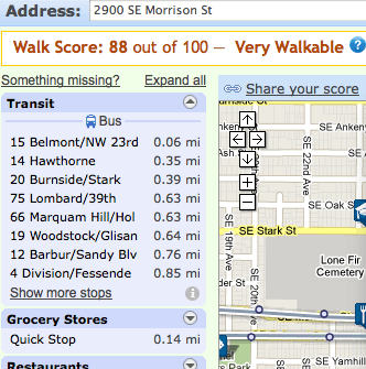
Currently, transit proximity does not factor into the generated numerical score. But, when a user searches for an address, transit stops (and the lines that serve them), along with nearby services and destinations, are displayed on a map, and listed in a sidebar. Owing to the importance of transit for non-car mobility and the pedestrian lifestyle, transit stops are the first listed items in the sidebar. Here’s a screenshot.

Transit stop locations and services are derived from publicly-available Google Transit feeds (see also GTFS Data Exchange). The week after transit information was incorporated into WalkScore, many agencies made their GTFS data public. Walk Score has a nice writeup on how they gather and use transit data.
The plans for incorporating a “transit score” into the walk score look promising. UPDATE (11/28): As envisioned, generated transit scores will take into account the number of stops within a walkable radius of given location, the number of services at those stops, and also the usefulness of those services. One proposal is to determine transit score by the usefulness of the services accessible from the location, and how convenient it is to access these services (how far away the nearest stop is). Usefulness is calculated by talking the walk scores of the locations that the transit network allows passengers to reach from that stop. This value is further refined by penalizing based on travel time (the presence of a line that provides direct, quick service to a services-rich downtown will produce a higher walkscore).
A neat example of the joyful surprises of making transit data openly available occurred for Trillium and one of our clients, Redding Area Bus Authority (RABA), in this process. Right after RABA made their GTFS data public, the one of the project developers, Brandon Martin-Anderson, used RABA data to test concepts and generate some transit score heat maps for a mid-sized agency. You can see the results on the WalkScore wiki.

Aaron. I’m not enough of a geek to figure out how to respond to the Walkscore wiki page you link to, but there’s a very very big problem with any scoring that gives weight to the “number of stops” in the vicinity. The fact that you can walk to multiple stops on the same line has absolutely zero value to your transit mobility. You only need one stop. That’s why transit planners are often trying to take stops out and/or implement policies that create consistent and generally wider spacing.
In my view, the transit-shed calculations/maps that Walkscore already does constitute the best basis for a transit score, because as I understand it, they already integrate service speed, frequency, and number and extent of lines in the best possible way: by measuring the combined output of these things rather than obsessing about how to weight them individually.
The transit-shed maps (“where can I go in 45 minutes?”) could easily be converted into a single score by overlaying them on demographic databases that would show the percentage of the urban areas population and/or jobs that are in that blob. That’s the only way I can think of to make a single “transit score.” It wouldn’t be comparable between cities, but if the purpose is to help people make good location judgments within cities, it doesn’t have to be.
Please pass this on to them, or advise me on how to.
Thanks, Jarrettt
Jarrett:
Good point. I think mis-represented the current proposals somewhat. The current proposals include one option that would count the number of stops nearby, but that’s pretty much for discussion purposes only. More sophisticated proposals are to determine transit score by the value of the services accessible from the location, and how convenient it is to access these services. But with the way they are presented, it seems some of the issues you bring up have yet to be fully considered / dealt with.
So, inspired by your comment, I posted a short message to the Transit Developers group (scroll to bottom to see my contribution to the thread):
http://groups.google.com/group/transit-developers/browse_thread/thread/626d82cff50c3b41
You may want to chime in there to discuss further.
Transit Developers (http://groups.google.com/group/transit-developers/) is where a lot of interesting new work makes its debut, so if you’re interested in this stuff, that’s a good way to get a front row seat.
-Aaron