An Interview with Matthew Barnes and Sarah Hackett: How ODOT Uses GTFS Data for Planning & Analysis
The Oregon Department of Transportation (ODOT)’s recently released Key Transit Hub Report and Transit Network Report mark two more milestones in their utilization of GTFS data for planning, analysis, and coordination. The Key Transit Hub Report describes using GTFS data to identify “Key Transit Hubs” (KTH), defined as a transit stop or cluster of stops served by 3 or more general public fixed route transit services (each with a unique service area). These hubs are of particular interest because of the broad connectivity they foster by serving as a locus for many public and private transit operators. From one such hub, a rider has the potential to travel more broadly than from other stop locations — to the next city, across the state, or even to adjacent states.

The Transit Network Report similarly uses GTFS and Census data to identify transit providers in Oregon, how they are funded, services provided, and how they all connect across Oregon. Temporal connectivity, or how long it takes to make a connection, and spatial connectivity, the number of routes/providers connected at transit hubs, are both quantified. Utilizing Census data allowed ODOT to see how accessible transit was to different populations between 2018 and 2019. Metrics discussed include route miles per capita, percent of population, percent of workers served at levels of service within a ½ mile of a fixed route, and Title VI analysis, among others.
To learn more about the Key Transit Hub and Transit Network Report’s goals, findings, and what it means for the future of transit in Oregon, we spoke with Matthew Barnes (Public Transit Network Manager) and Sarah Hackett (Public Transportation Network Coordinator) at ODOT.
Here are a few quick links to particular themes below:
GTFS Analysis
Key Transit Hub and Transit Network Reports
Transit Investments
Looking to the Future
GTFS Analysis
Chris Perry: Why does ODOT use GTFS in the statewide transit management and planning process? Does this make things possible that wouldn’t otherwise be possible, and could reports like these have been written 10 years ago?
Matthew Barnes: At least part of the answer of why we use GTFS is that it’s effectively free for analysis. The trip planning value of it justifies the investment in the data, so given that we’re using it already, it’s a nice resource to have available for analysis purposes.
Sarah Hackett: This would not have been possible 10 years ago.
Chris: ODOT utilizes the Transit Network Explorer Tool (TNExT), an open source, web-based software for visualization and analysis of transit in Oregon. Can you provide a little background on TNExT and its use of GTFS data for analysis.
Matthew: We initially got interested in GTFS because of its trip planning power. After a while we realized that we were dealing with a model of the network, and it was silly not to be taking advantage of that model. That was the birth of the ideas around TNExT. It started as a research project supported by ODOT and Oregon State University. A few years ago we transitioned the care of TNExT to Trillium.
One of the ideas behind it was to provide easy access to information about the network to ODOT staff that need it. Within ODOT we can work with our GIS group or our transportation network and analysis group to make things happen, but it can be a high-friction process. You may have 1 research idea that takes a few months to define and execute. Afterwards you may realize it isn’t quite what you wanted, and you must modify it, and then that takes a few more months. With TNExT you can do all that in minutes. So that was the vision. I think we fell short in a few areas in terms of having a rather complicated user interface, and the fact that we have snapshots of data rather than a continuous record, which makes date-related issues complicated and confusing for new users. But we’ve learned a lot in the process and we have federal AIM grant funding to create a TNExT version 2. Hopefully we’ll come closer to meeting those original ideals.
Sarah: TNExT does use 2010 Census data, so it is hampered by a lack of current population data.
Aaron Antrim: Has TNExT yielded certain insights that you wouldn’t have been able to discover otherwise?
Matthew: I don’t know that we can put a finger on a particular piece that’s changed what we’re doing dramatically, but around 4 years ago we started integrating the concept of key transit hubs into our competitive grant programs. So if you’re making investments into a key transit hub, you get more points and there’s a greater chance of your project getting funded. We recently increased resources sent out into the state from $50 million/year to $150 million/year, and thought that TNExT would allow us to clearly see those impacts. Unfortunately COVID complicated that a lot. We now have this mixed environment where COVID pulls in one direction and these new resources pull in another. We did a very simple comparison between March and June 2020 using TNExT. What we saw was that coverage statewide improved, but the frequency of service reduced. That might be due to competing forces in the system and COVID impacts. That’s an area we’d like to investigate a little bit more and understand better.
Sarah: Matthew, would we say those results were a consequence of new STIF (Statewide Transportation Improvement Fund) funded routes that were implemented for a short time?
Matthew: It was a look at a single day, so I think it’s more likely that there’s more service out there, but some of the service frequently was cut back. One dramatic example of that would be the for-profit providers who do a lot of miles even if they don’t carry many passengers. Greyhound dropping from 4 round trips per day to less than 1 round trip per day at one point was pretty dramatic. There are similar instances with passenger rail. It’s worth taking a deeper look at it agency by agency and doing comparisons to get a better sense of what’s happening.
Another area we’re quite interested in is population and employment served, which can be an equity of funding indicator. We always have this friction between sending money out to rural Oregon (where you don’t have very dense populations) versus to more urban areas. What is the right distribution of resources and what does that look like over time? TNExT lets us begin to understand that better. We’re at the point where we don’t have a long record of history, and it’s also data that’s not available anywhere else, so we’re in this position of having data that’s really rich and unique, but we don’t have enough context yet to fully take advantage of it. Having a longer record and seeing both change over time and the relationship between things like financial inputs to the system and resulting system changes will allow us to come to better-informed conclusions. Those are all going to be really interesting and none of that would be possible without TNEXT and GTFS data.
Key Transit Hub and Transit Network Reports
Chris: What analyses were performed to get from the GTFS to these results on key transit hubs, reach, etc. What other datasets, tools and software are used? Would other features or software help with this process?
Sarah: TNExT can produce a number of different useful reports. We need to manually refine the key transit hubs identified by TNExT to make sure that we only count transit agencies with unique service areas for example we don’t count the Aerial Tram, and the Portland Streetcar because those service areas are wholly contained within TriMet’s service area . For the Key Transit Hub report we also used TNExT to get local routes vs. regional, and total miles.
Multiple routes serving a KTH may enter and/or exit a city on the same road. Duplicated sections needed to be removed from consideration. We did calculations to get these unique miles, which we called original miles. We used tools in addition to TNExT to get to original miles.
Matthew: TNExT’s transit hubs tool is primarily a stop clustering utility, so it bunches nearby stops. We look at the number of agencies that serve a certain stop or stop cluster, and that creates a ranked list. As of April 1st, the highest number of agencies serving a stop cluster was 12 in the Portland Metro area.
Chris: The Key Transit Hub report found that, of Oregon’s 36 counties, 32 (89%) contain a transit stop for a service that connects to a KTH without a transfer. Some counties contain multiple services and some only contain one. Does that seem feasible to get to 100% in the next 5-10 years? How does having this data affect interactions with interstate service providers such as Greyhound and Amtrak?
Matthew: I don’t know that we are confident enough in what this means to bake it into goals at this point. We have lots of interesting statistics. The tough part is separating out ones that really deserve action from the ones that are merely interesting. I think that’s going to be an ongoing process for us. We’ve identified this disconnect between policy and analysis that’s common across organizations. You tend to have different personalities playing in the analysis world versus the policy world. You may have great information that’s potentially actionable, but the communication flow and the understanding between the analysis side and the policy side sometimes doesn’t go well. We’ve been having internal conversations about how to make our organization maintain attention to that potential situation and avoid losing the value of investments in the data and analysis.
Sarah: Key transit hubs only provide an analysis of fixed route transit. In more rural areas, or counties with very few key transit hubs, there are often demand response services that provide services and connections that, in urban areas, would be provided by fixed route transit.
Matthew: Hence the hope of a TNExT v2 that integrates GTFS-Flex and/or GOFS.
Sarah: Really, 100% is not necessarily the goal. Part of our problem is determining transit needs, and that’s really a local provider assessment. There’s really no value in providing transit from point C to Z if there is no demand for that route. It is more important to foster and create connections that are useful.
Matthew: That stimulates another line of thought, which is that it’s pretty clear that people want to get in a vehicle and go from where they are to where they want to be. But with fixed route transit service it’s just not financially possible to directly connect all the destinations or cities in the state. So what that means is you have to rely on transfers for a fully functioning fixed route system that gives you access across the state. Our off-the-cuff guess is there are a low number of trips, percentage-wise, that involve a transfer, especially outside of an urban area. So you can expend a lot of effort adjusting timing and pulling together spatial connections, but what does that mean in terms of real benefits for riders?
If you don’t have proper temporal or spatial connections you know that no one is going to transfer. The first step is creating the opportunity, and maybe you also need a culture shift in terms of people’s expectations and behavior. Additionally, transit agencies need to pay attention to the passenger experience at these transfer points. It is not unheard of to have well-timed transfers with a couple different agencies, but zero or confusing passenger information, so if someone is coming to that transfer location for the first time, maybe they know a bus number, but then there’s 6 different places where buses pull in and no signage. It can be a pretty intimidating experience. So how do you both create the spatial connections, the timing connections, the passenger experience, and culture change to get to the point where people feel comfortable getting on a bus and making a couple transfers to get where they need to go?
Sarah: Another anecdotal feature of the key transit hub report is the concept of “almost” key transit hubs where transit agencies are missing an opportunity to connect with another agency’s route. In the city of Salem, for example, some transit providers stop at the downtown transit center and others serve the Amtrak station. Those locations are about 1 – 2 miles apart which is walkable, but not what some riders would consider convenient. There are other “almost” key transit hubs that could probably be revised to make them key transit hubs, by moving stops of different agencies closer to each other. That’s something that ODOT plans to give more attention to.
Aaron: Sometimes removing a key transit hub to consolidate routes or agencies could be a good thing. Is that something that you’ve seen?
Matthew: There are cases where seeing a bunch of key transit hubs implies duplication of services and consolidation opportunities.
Aaron: It sounds like the next step is asking “What does it mean?” Should a connection be maintained, improved, or refined, say, through service consolidation?
Matthew: That’s right. For the most part, a key transit hub represents an opportunity, but there are cases where they’re not so much a connection opportunity as a restructuring opportunity.
Chris: You touched on this earlier, but how does having this data on key transit hubs affect interstate travel and interstate transfers? Have you looked at Greyhound, Amtrak, or others in Oregon in your analyses so far, or are you sticking with services that operate solely within Oregon?
Matthew: We’re quite interested in Greyhound, Bolt, Flixbus, and whoever else is operating in the state. Generally, we have little or no leverage, for example, to get Greyhound to change a stop location, unless we’re offering them great amenities or better value, etc, but we do want to encourage local connections to interstate carriers. That’s, in our mind, part of the value in publicizing key transit hubs. We’re saying to those local transit providers who are serving the Greyhound or Amtrak station, “Woohoo! Good job and we want to help you invest in that connection.”
Transit Investments
Chris: Given both reports’ reliance on Census data, and the subsequent comparisons using population, can you explain how ODOT does or does not consider population size as a driving factor for investment? What measures are taken to not exclude smaller and/or rural communities?
Matthew: That’s a good question, and it comes back to the point about equity. What does equity mean in terms of transit investments when you have parts of the state that are so dramatically different? The funding structure nationwide is such that a lot of FTA funding goes directly to urban agencies and doesn’t pass through ODOT. So there’s kind of an automatic bias towards large urban areas, which makes sense because that’s where the majority of people are. With the STIF funding, ODOT’s focus has transitioned from being almost entirely rural, to a mix of rural and urban because this new funding can go to large transit agencies in urban areas as well. We do look at population and ask questions like “How effective are we serving the population?” It’s less common for us to say, “This community has a population of 100,000 and that community has a population of 50,000, let’s allocate twice as much money for the larger community.” That’s not really the way we operate. Access is really important. Take a core service that maybe isn’t super functional, but gets someone to other communities via 1-2 round trips per day. We value that pretty highly. And of course one of the dynamics is that for ~90% of the money that goes out of ODOT’s door for transit, the way it’s used is up to the local and regional transit providers. We only have the discretion to directly shape the way ~10% of the transit resources flowing through ODOT are deployed. The competitive grant programs through which we do that shaping aren’t the only way we can have influence. Communication, information, expressing priorities, and asking for certain kinds of reports can all help to shape transit provider perspectives and choices too.
Chris: What other factors are taken into account when considering future investments in service across the state? What are the “needs” metrics?
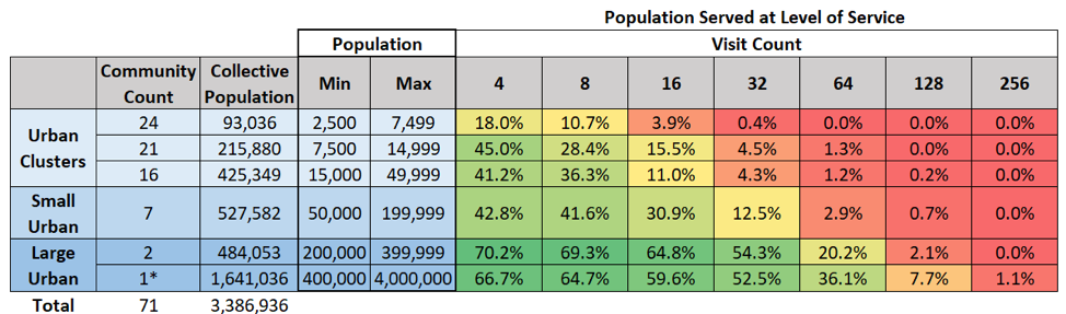
Matthew: One of the interesting composite reports (a report of reports) that we pull out of TNEXT is the ability to segment urbanized areas and urban clusters by size. Say we break up communities in Oregon by population and make 5-6 groups of communities by population ranging from the smallest community up to the Portland area’s size. We can look at the percentage of population served and corresponding level of service to create a chart that shows you, for instance, at 2 visits (by visit we mean a scheduled stop within 1/4 mile) in a large urban area maybe you’ve covered 60% of that population. As you step down the population scale to smaller communities maybe that 60% might turn to 40% to 20% to 10%. As you increase the level of service or number of visits, 32 visits or 64 visits, population served falls off at different rates depending on the community size range you’re looking at. One approach you can take is to look at those groups of population sizes, and look at the way level of service falls off. Then for individual communities within that set you can ask the question “Are these guys underperforming, or are they under-resourced? What does their level of service look like compared to other communities of similar size.” That can be a way to think about resourcing different communities. Of course, there are other factors. Some communities are more compact, and it’s trivial to serve a large percentage of the population. Others are much more spread out so it’s not as simple as that. It’s just one metric that one can use to begin to look transit across different community sizes. It’s not something we’re actively using now, but it’s something we’re thinking about.
Aaron: So the number of visits is an indicator of the amount of delivered service.
Mathew: Right, and obviously it’s imperfect because it doesn’t tell you anything about the usefulness of that access, but it’s somewhat more substantial than a lot of other metrics we use.
Aaron: As opposed to just say, coverage.
Matthew: Right
Chris: That’s where 2020 Census data would really come in handy.
Matthew: The place we’d like to be is to have high quality population projections. When you have that, you can pull out future transit system plans and build a future network based on future population. That’s something we’ve been talking about for a while, although there are a lot of pieces that need to come together to make that happen. It’s an interesting prospect.
Aaron: Are these projections something that the state develops, or is it a federal agency or private source?
Matthew: Portland State University (PSU) does population projections, but I think the resolution of those projections only goes down to the county level, so to have an actionable set of data you need to invest in making projections at a much smaller scale. At least that’s how we’re thinking about it now. We had some conversations with our planning and analysis group. They were initially enthusiastic until they really thought through what it would take to give us what we’re looking for, and they said “Whooaa we’re not ready to take this on.” So it didn’t happen.
Looking to the Future
Chris: What, if any, direct actions have occurred as a result of these reports? Are there any planned in the near term?
Matthew: I think that key transit hubs, and the way we’ve wrapped them into our discretionary grant programs, is the clearest example of an action tied to those reports. Sarah, is there anything else on your mind that falls into that category?
Sarah: Not at the moment, but we are trying to ensure these reports are not one-offs. We hired Kittleson to do much of the transit network report, so we are not going to be able to duplicate that on a frequent basis. We are trying to hone in on which metrics make sense to track over time so that we can use them as a benchmark for future comparisons.
Matthew: We have this “embarrassment of riches” of data. As a result, we’re in an ongoing process of struggling to figure out which data elements are most actionable and what we should be paying attention to so that we can relay that to the policy group within our organization. That gets back to that whole question of closing the gap between analysis and policy, and turning analysis into policy changes and changes in how we deal with the transit world.
Chris: With great data comes great responsibility!
Chris: What goals are on the horizon, specifically with regard to data specifications (like GTFS and its extensions) and ODOT’s analytical capabilities? One that comes to mind is GTFS-Flex, which makes it possible to model demand-responsive services.
Additionally, the proposed GTFS-ride extension, which allows for ridership data collection, would make it possible to track boarding and alightings across the system or per stop, etc. Future reports could incorporate GTFS-ride data to track ridership between service changes that affect connectivity and allow us to see what a convenient transfer does (or does not) do for ridership.
Matthew: In some sense you’ve sketched out our planned future in this question. We have a federal grant to create a TNExT 2 which includes GTFS-ride and GTFS-Flex data as it’s scoped out now. We, as you probably know, are beginning to invest in other extensions to GTFS and GTFS-Flex that get at rider eligibility, trip purpose eligibility, and service capability information. We think these will be great from an equity perspective, for trip planning, and also really nice from an analysis perspective so we can ask questions like “Given a particular rider need, what do the gaps look like in the system, as opposed to gaps for a generic rider who can get on anything?”
GTFS has a well-developed ecosystem and we have close to 100% data coverage in Oregon. GTFS-Flex is more of an emerging standard, but is getting traction in a number of ways. We’re starting to invest through Trillium in creating statewide GTFS-Flex data. When our eligibility extension comes along we hope to create a rich version of GTFS-Flex for the state.
GTFS-ride is more in its infancy. There’s not much of a software ecosystem developed. We have a grant with OSU that’s doing software development work with Trillium. There’s a fair amount of work to be done to get to the point where it’s realistic to expect GTFS-ride data from Oregon agencies. There are probably 2 super-critical pieces. One is a GTFS-ride editor that small agencies can use. It needs to be a tool that’s no more complicated than a spreadsheet to use, and ideally more convenient than a spreadsheet. The other piece, and OSU/Trillium is working on this already through a 3rd party contractor, bridges between APC and AFC software formats to get a GTFS-ride dataset. There are a lot of supporting pieces that one could imagine would be useful as well. Building up that critical mass of a software ecosystem that creates a value proposition to invest in GTFS-ride from the agency perspective is what really needs to happen to move that forward.
Aaron: So for a small agency that would publish GTFS-ride data, what is the value for them?
Matthew: I think the first value is understanding and managing their service, and making judgement calls. “Is the money we’re putting into this system is correct, or should we be sending it somewhere else? Is it reasonable to have fixed route service here vs demand response service?” One of the issues for smaller providers is that their level of data aggregation may be really high. They may only have counts for runs or counts for days vs boardings and alightings at each stop. The analysis value of some of that ridership data may be less rich right now than we’d like to see in a perfect world.
The hope or promise with GTFS-ride is that if you have a standardized way of expressing ridership data, then software vendors can invest in easy-to-use tools that can make sense of it instead of always dealing with 1-off systems with proprietary data formats and those kinds of things. For small transit providers, if we really have a tool that’s no harder to manage than a spreadsheet, that puts public transit in a position where we could slowly transition towards asking providers to publish GTFS-ride data, perhaps even as a reporting requirement.
Chris: That would allow them to determine the difference between an assumption and a reality. In a lot of smaller communities, there is a more personal relationship with riders. You may have some squeaky wheels that say “I want this or that done because it’s affecting my commute”, when ridership data may in fact tell a different story about the needs and behaviors of many more travelers. Transit agencies may be able to put money where the data shows the greatest need.
Chris: Can you speak to the value ODOT sees in these data standards vs letting proprietary software handle everything for you?
Matthew: I tend to think of that value in two categories One is the passenger experience fork, where standardized data for example makes possible seamless trip planning across transit agencies; Google, Bing, Apple maps and all the other tools for transit trip planning. The other value category is system management. ODOT aspires, in a limited sense, to be a system manager. You can’t be a manager if you don’t understand your system. If you can’t see your system from a variety of perspectives, you don’t know the relationship between inputs to the system and the way the system responds.
Aaron: I’m realizing it’s been a 10 year project to improve the system to where we are now.
Matthew: Yeah — 10 plus. I was just looking at when our first Trillium contract went into effect. I think it was 2009. Time flies!
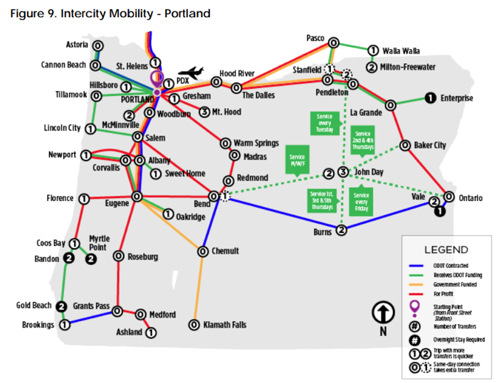
Sarah: When you provide information with some really usable graphics and data that individual transit agencies have never seen, like the Transit Network Report, you see immediate responses from agencies. The Transit Network Report includes a series of intercity mobility maps (ex – Figure 9) which show someone could travel on transit between several communities, how long it would take, the service providers on these routes, and how the routes are funded. Both ODOT regional transit coordinators and transit agencies have reached out and said they are one of the most interesting visuals they’ve seen. All of these were created with open data.
Chris: Given the tools that ODOT is using and actively developing, what does all this say about the future of transit planning in Oregon?
Matthew: I guess it says that things are changing on many fronts, and if we emerge into a future with more mobility as a service (MaaS), and fully autonomous vehicles become a reality, we could be working in a pretty interesting and different environment. But I think the investment in these data standards is foundational to creating a functional MaaS system in a lot of ways, and maybe, assuming ODOT continues to pay attention to this, Oregon will be in a better position to understand and shape the impacts of these trends.