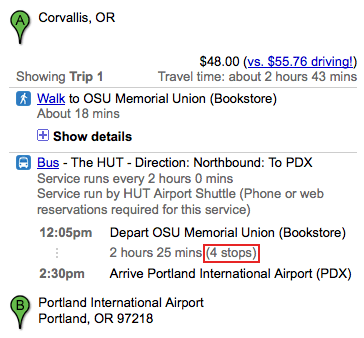
Google Transit feature: number of stops
Google Maps introduced a new feature to transit search results recently. In addition to providing the time duration of a travel leg, the number of stops also appears. Screenshot below.
At first, the data nerd in me liked this new feature. The new information presented is simple. It doesn’t take up much space in the interface. It is an interesting way to measure the journey.
But, as I’ve thought more, I’ve wondered what a passenger would do with this information. Comparing express vs. local services, for example, can be just as easily accomplished by looking at travel durations.
Any other ideas or comments?

Nice catch, Aaron.
My hunch is that this is most useful as a tool for irregular rail riders. I know when I’m on the rail in an unfamiliar city, I’m constantly counting “X more stops,” rather than picking up on the ambient location cues that I get from glancing out the window on a system I know well.
Right. I think it would make the most sense for a mobile interface then. My iPhone doesn’t show the number of stops (it doesn’t show travel duration, only departure and arrival times). Does anyone know what shows up in the current versions of Google Maps for mobile for other platforms?
Good point. My HTC Incredible’s Android map app offers arrival, departure and travel times on the index-y page where I select a trip among several, but not on the stop list itself.
Every time I mention my phone on the Internet I feel obliged to add: having owned both an iPhone and the Incredible I do not recommend the Incredible or, in general, Android. I find it less stable, less versatile and less usable.
I’d rather count 4 stops, rather than 2:25 minutes. Also the number of stops is usually invariant of delays etc. (except maybe in New York, where local trains might suddenly run express, but that’s another story…).