Mapping transit frequency online
Jarrett Walker at humantransit.org makes the case for frequent transit network maps.
If you look at almost any street map, a map designed for motorists or to give people a general sense of the shape of the city, you’ll see clear signals that the lines on the map are not all equal. A Google street map of this same area [referring to downtown Seattle], for example, uses simple line-weight and color to visually distinguish three classes of road: (a) freeways, (b) local arterials, and (c) other lesser streets. We all use this hierarchy to organize our understanding of the city, regardless of our means of travel.
If a street map for a city drew every road with the same kind of line and label, so that Interstate 5 looked no different from the smallest gravel cul-de-sac, we’d say it was a bad map. But it’s not wrong, the mapmaker would say! No, it’s not, but it’s misleading. If we can’t identify the major streets, we can’t see the basic shape of the city, and without that, we can’t really make use of the map’s information.
The process of learning any network — roads or transit or any kind of geography — begins with identifying a few features as major, and then understanding how the other features fit around those. If you’re looking a map of natural geography, you’ll notice the big rivers and mountains before you notice the small ones. If you’re looking at a highway map, you’ll understand the big highways first, and later, only as needed, you’ll study how lesser roads connect with those main highways. Transit customers and potential customers need the same ability to sort the mass of detail presented by a transit network.
So a transit map that makes all lines look equally important is like a road map that doesn’t show the difference between a freeway and a gravel road.
To show network frequency, Jarrett writes, many transit agencies have published frequent network maps. The examples he provides (TriMet’s frequent network map and L.A. Metro’s are some) are designed for print.
To my knowledge, there are not any maps designed specifically for the web that show frequency as a distinction of service. This seems somewhat surprising because, with source data becoming increasingly more available, it becomes possible to create a map application that shows services with greater service frequency, or which differentiates service frequency levels by colors or line thickness.
Let’s look at the most popular map application out there, Google Maps. In selected areas (mainly metropolitan areas where transit agencies provide data to Google), Google Maps offers a transit layer. The next screenshot shows where to find it.
![]()
Jarrett makes the point that internet trip planners mean that system maps are less important or necessary in many instances of trip planning. However, the system map is still important for understanding a system and its role within the city and our lives. Frequent and infrequent services are not distinguished in the Google Maps transit layer. Therefore it’s less easily possible to use this map to determine, for example, where to live or locate a business for access by frequent transit, or develop an understanding of how to use the system freely, without the aid of a trip planner.
Instead of distinguishing transit lines by frequency, Google Maps distinguishes lines by mode. The screenshot above shows bus lines in blue, and light rail (update/correction: and street car) lines in a shade somewhere between maroon and lavender. Presumably, the colors are set according to the route type specified in the GTFS data provided to Google.
Here’s an interesting choice: If we zoom farther out, we see only rail services. In the screenshot below, we see Portland’s light rail lines in the lavender shade and the standard-gauge WES rail service in a pale green color.
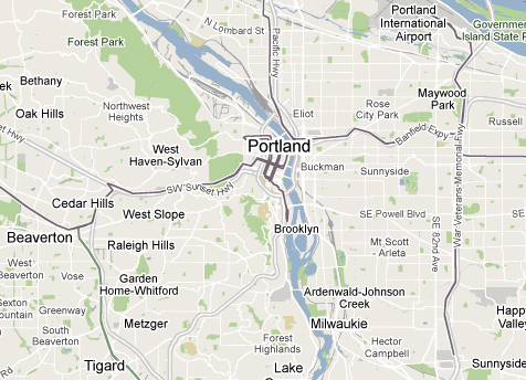
The approach seems to work well enough with the current Portland example, but as more transit services are added to Google Maps/Transit, I foresee some limitations. Here is one example: ODOT hired Trillium to publish GTFS for Oregon’s intercity bus network. These bus routes span distances that are hundreds of miles. Currently, if the services were shown in the transit layer (they are not), the services would only be shown when the user is zoomed fairly close in. That’s not particularly useful; these intercity routes are the equivalent of highways in the road network. Travelers want to see how they connect cities.
Therefore, I’d suggest that, instead of determining which services are shown at each zoom level by the vehicle type, Google Maps should determine this by the length of the route alignment. If there was complete coverage (including Greyhound and Amtrak), this means that if the user is zoomed to the country level they would see the national bus and rail network. Zooming in, she will see state and regional transit services. Finally, zoomed into the city level, she will see local municipal routes. And it is at this zoom level that it would be useful to have an indicator of the frequency of routes (either with line thickness or color) to better understand the local transit system.
Aaron. The intercity example you show is another reason Google just has to discover frequency mapping. Those intercity routes on a transit layer are just going to muck up the presentation of the urban network.
Note that Google’s current mode-based mapping promotes the commuter rail line WES, although it’s less frequent than the vast majority of Portland’s bus routes.
Colour for mode, thickness for frequency, zoom level for route length… sounds good to me!