Quick — when is the next bus scheduled to arrive?
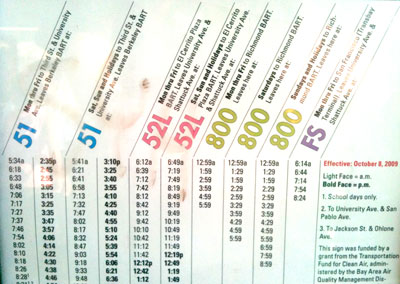
Recently, I visited the San Francisco Bay Area. My friend Andrea, who lives in Berkeley, pointed out the inconvenience of transit timetables that separate all the scheduled departures by line. If there are multiple lines that travel to some of the same locations, the passenger just wants to look up ALL of the next opportunities to catch a bus, not just those for one particular line (to see an example of why you’d want to look up information this way, look at Lines 52L and 51 around the Downtown Berkeley BART in the AC Transit system map). Andrea says that in Germany, information posted at a stop lists all arrival/departure times in order, with the line shown in the next column.


Can anyone help me find examples of German timetables?
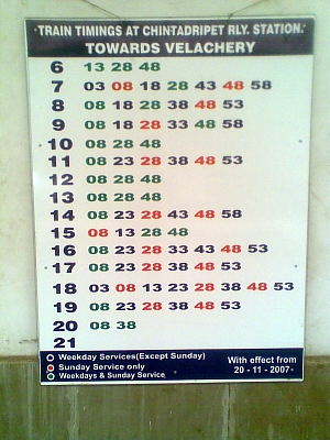
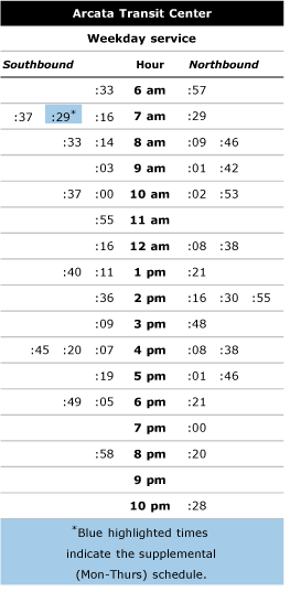
More details on the timetable in India here. See more on how Trillium implemented this format for timetable information for Redwood Transit System in the blog post “Avoid information overload with schedules for riders’ favorite stops”.
Note: I designed the AC Transit pole schedule printed above. (If you’d rather have an electronic version of the artwork, let me know.)
Yes, if your destination is on two or more lines, it’s a lot better to have them all on one big list. But what if your destination is somewhere else? For example, if you’re trying to get to University Village in Albany, you can take the 52L, but not the other lines on the sign. Interleaving the 52L times with the 51 times would make it harder to find the 52L times; you’d have to go through each time, saying “is this for the right line”? That’s going to lead to errors.
Moreover, differentiating the lines is difficult to do in a clean way. The Indian multi-line schedule printed here is deficient in that it differentiates the different lines only by color. In the best conditions, a substantial percentage of people (somewhere between 4-5%) cannot see color, so we cannot differentiate information only in this way. (In low-light conditions, even more people would have trouble seeing the color differences.)
So we would have to put some kind of footnote on, or use a different type style, or something. That would tend to clutter up the sign and make it harder to understand.
Breaking the times down by hours does take up less space (since less information is repeated), but I’m not at all convinced that people who aren’t experienced using the schedules find them comprehensible. The way people are used to seeing times is as a single number “5:30”. Separating hours and minutes is not going to be immediately comprehensible to most people.
Our signs are designed to be comprehensible to people who are not (yet) experienced with transit. It is probable that we could make further improvements, and we hope to do so. But I’m not convinced that a more complicated system will make it easier for us to attract new riders.
I’m the one who griped that the AC Transit schedule shown above is too complicated. My main criticism is that it not as customer-friendly as the Indian or German examples, because of how the information is organized. The AC Transit schedule is primarily organized by bus line, with scheduled bus times as the secondary/dependent variable. But in my experience, the main question in a bus rider’s mind when they arrive at a bus stop is “when is the next bus?” Many routes overlap, or you may take a different route depending on which bus pulls up first.
That’s why I like schedules that are organized by time as the primary variable. You should be able to first easily see what bus is coming to that stop next, then what line it is. Your eye moves down the list sequentially by arrival time, then across to see what line it is. In my opinion, this is the difference between organizing information from the customer’s point of view, versus that of the operator. There are many examples of rail systems schedules organized in this way. Or even on the the Max, when you are at a stop with multiple lines, the real-time electronic info usually tells you the next scheduled arrival is in so many minutes, and then what line it is.
Nice points about the color blindness issue, that is an important issue. I wonder if it is more or less comprehensible to separate the hour from the minutes or keep them together, ie “5:30”. Has it been tested? It seems even if it takes someone an extra minute to figure it out the first time they see a minutes-only style schedule, the next time they would be trained to understand it immediately. It removes a lot of redundant and dense information to just list the hour of day once. Of course, the 24-clock format helps, too, but it would probably be bit too much of leap away from US convention.
Oh, and one thing I totally miss when taking the bus in Berkeley is the Stop ID number system that Portland has. It is the quickest way to find out when the next bus arrives, and AC Transit doesn’t seem to have them. Yay Portland!
Andrea
Thanks for your comments, Aaron and Andrea.
First, I didn’t mean to pick on AC Transit. AC Transit does a great job of presenting information on stop poles and in bus shelters, better than the vast majority of other U.S. agencies. AC Transit’s posted information is quite good. It also happens to provide an opportunity to discuss and compare other potential approaches and their merits or disadvantages.
Distilling arrival/departure times for the stop at which information is posted (like AC Transit does) shows more effort than most agencies offer, which is to post full timetables for the routes that serve the stop (like TriMet does). The later approach also provides some benefits, providing more tools and information for trip planning, but also makes the information the rider is most likely interested in (when does the next bus come) harder to find.
Andrea points out that estimated/real-time arrival information systems almost always offer upcoming arrival information for all services at a given location, provided in the order of the next departure. That generally serves the needs of passengers well — both those who want to use the next available service (like when they’re traveling to, say, a downtown location that is served by all MAX lines), or when they need a particular service (MAX Red Line to airport).
But timetable information / scheduled service times are usually broken out by route in the U.S.
I guess TriMet’s approach is to go both ways — providing timetables for each route, and then providing real-time estimates in order of predicted arrivals.
I searched for papers that might compare various ways of presenting information at bus stops, but wasn’t able to find anything that explored this issue. It would be nice to have some research. The closest I came was “TRB Report 45. Passenger Information Services: A Guidebook for Transit Systems” (http://gulliver.trb.org/publications/tcrp/tcrp_rpt_45.pdf). Anything else? Aaron, did you use any manual or look to other systems examples when you designed AC Transit’s pole-mounted information?
Also, I am curious — are the pole-mounted timetables generated automatically from a database?
Transport for London has done this for years after they did significant market research in the early 2000s and found out that people want to know what services emanate from a specific stop and what the basic timetable is for each of those services from that stop/station (e.g., bus on Route 15 comes every 8-10 minutes from 13:00 to 16:00). Take a look at http://www.tfl.gov.uk/gettingaround/default.aspx and then go to Timetables, and then you can get a timetable by stop or route.
“But in my experience, the main question in a bus rider’s mind when they arrive at a bus stop is ‘when is the next bus?'”
*The* next bus or *my* next bus?
It all depends on the pattern of travel at the specific location. It’s probably true that a good portion of people getting on the bus at this particular stop are going to somewhere served by more than one of the lines. But that’s just one location. Further down the street at San Pablo Avenue, or across the street going in the other direction, all these lines are about to diverge, and at those locations it’s crucial to get on the right bus.
If you look through our system map, there are some routes that overlap for large sections (you could make a good case that we should merge lines like 1/801, 51/851, 40/840, etc.), but most overlaps are relatively short, and last for only a small percentage of each line. So I don’t believe that, in most places most of the time, people want to take the first bus. Instead, they want to take the right bus.
It would actually be a lot easier for us to produce the things if there was just one big long list, rather than several different lists of various lengths that we have to move around to make everything fit. But I don’t think that would serve the riders.
I’m not suggesting that our way is necessarily the best way to provide the information, and there are certainly aspects of our signs that are problematic (the slanted headers, for one thing). Maybe hour headings would make it easier to find particular times. But I think the “throw it all together and let me figure it out” way of showing data works really well for people who are well-versed in the subject and already have the incentive to work on it. They want the big picture. But I think most people just want to know the information they need to get home (or wherever they are going).
Although regular riders are one audience for the signs, one of the main purposes behind having the signs is to inform non-regular riders that the services exist. Expecting users to be “trained” on using the system is a pretty bad idea when we have as low a mode share as we do.
MTC is working to bring Transit-Tracker type service to the Bay Area through the 511 phone system. At this point it’s hard to say when it will actually happen, since we have such a small percentage of our system being predicted through Nextbus.
I had read TCRP Report 45 and TCRP Synthesis 17 (“Customer Information at Bus Stops”), back in 2000 when the original design was created. We did consider listing stops by time and not by route at that time, the way Denver is shown as doing in TCRP Synthesis 17, but rejected it on the basis that we felt that it was difficult to find the route one was looking for.
More recently there has been work done at the National Center for Transit Research at the University of South Florida on printed materials (http://www.nctr.usf.edu/abstracts/abs77710.htm).
The pole-mounted timetables are created in this weird hodgepodge of FileMaker data entry, InDesign layout, and a bunch of little perl scripts that mash them together. A person picks out the relevant column (or columns, sometimes) of the timetable and enters that specification into a FileMaker database. (If the times change but the schedule timepoints stay the same, we don’t have to re-enter the specification.) A perl script reads the specification and the times (previously extracted from the scheduling department’s Hastus database) and outputs the times in InDesign Tags format, which is then imported into InDesign. Then we print the page on our large-format printer.
It’s nobody’s idea of the ideal system, but it works and allows a very small number of people to keep updated over 1900 indivdual schedules. I am, slowly, rewriting the perl scripts to be less ugly and hope to open-source them someday.
Everyone on this thread is right. It really does depend on the configuration of services, and how obvious the service patterns are. I have a bunch of unsorted pics of German signs, but the ones that are sticking in my mind are separated by route in the same spirit as the AC Transit example, partly because (as at AC) different services have different brands. If the AC Transit sign is accompanied by some information on where each of the routes goes, or at least its name and direction, I think it’s pretty good.
Brisbane does an interesting thing at its downtown stops where multiple routes stop. The present a little map showing just those routes, so that people can quickly see if and where they run together and exactly where they diverge. I can photograph one of those for you next time I’m in Brisbane, if you’re curious. It seems to me that’s exactly the information you’d need to supplement the sign in the AC example.
Also, if you’d like, I’ll go take a photo for you of signs here in Sydney. They’re exactly what Andrea is suggesting, a big list of times, sorted by time, with the route number next to each time. Problem is, the network is really complicated, with 3-digit line numbers and lots of overlapping routes turning different directions, so you really have to know what the route numbers mean to make any use of it.
Ask me offline, or via the email link at humantransit.org, if that would be useful.
Hey Aaron,
There are tons of german timetables at db.de… it’s on their online “routebook.” Let me know if you want help finding a certain route specifically. (Now with tinier URL)
http://tinyurl.com/yd68nqf
Emily